Our generation, unlike the previous one, has come to rely on consumer data as a means of enhancing the success of marketing campaigns among other things. Today, several reports have indicated that over two and a half quintillion bytes of data are generated every day. That is an enormous pool of data lying around for marketing teams to take advantage of. However, there is a need to identify the forms of data visualizations that are best suited to accurately analyze this huge gold mine.
In this post, we will take a quick look at the different forms of data visualization. However, to fully grasp what they are and how you can apply them, we will need to take a quick look at what the concept of data visualization implies.
Understanding The Concept of Data Visualization
In the simplest term, the concept of data visualization is the pictorial or graphical representation of data. This helps marketing teams that make significant decisions in any company use a visual layout for what would otherwise have required complex analytics. As a result, they can identify difficult concepts or observe new patterns.
Every company has access to track several data points ranging from the results of marketing campaigns to the performance of the marketing team. You can also track several points of data from the metrics of your website.
One of the benefits of data visualization is that it assists you and your marketing team to pass clear cut reports effectively and quickly. This is quite helpful in saving time and getting things done despite having tons of stuff to clear from your desk. Click here to learn more.
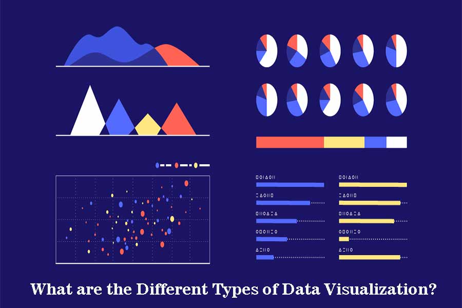
Different Forms of Data Visualization
Here are a few forms of data visualization that your team needs to take advantage of:
- THE BAR GRAPH: Most times, we use a column chart and bar graph in similar ways. However, it is quite evident that the column chart will not give you enough comparison space or room for your labels. Hence, the need to employ the use of a bar graph in a scenario where there is a need to work around longer labels. This form of data visualization is also great when you need to show negative numbers and compare items that are above 10. Hence, you draw your graph on the typical X-axis and Y-axis of a bar graph.
- THE PIE CHART: In this form of chart, you are trying to represent a single number by allocating data into the several categories that it constitutes. Typically, these categories are displayed in a percentage format. Hence, the summation of all of them should equal the single number that you are trying to represent which is 100 percent. This form of data visualization is best suited to represent the analysis of marketing expenditure, shares, or the demographics of your customers, etc.
- THE BUBBLE CHART: This form of data visualization aims to display distribution or relationships. Although the bubble chart performs a similar function to another form of data visualization commonly referred to as a scatter chart, their differences go beyond their visual similarity. In the bubble chart, you have to use bubbles to substitute the data points on the scatter chart. You also do not need a category axis in this form of data visualization. Instead, you have to draw your data to portray X, Y, and Z values in a bubble format.
In conclusion, data visualization helps to portray the complexities of data analytics in a simpler and easier to understand form.